What a process.
Everyone told me to wait. Okay, I knew I didn't need a logo yet-I had no idea if Writer's Infusion was going to take off, and I had to launch Writer's Infusion with as little money as possible.
But... I really wanted a sweatshirt.
I did. A nice, thick one - hood, no zipper - in one of my favorite clothing colors (fern green, periwinkle blue, or dark grey), with the "Writer's Infusion" logo on it. And I couldn't get the sweatshirt if I didn't have the logo. It was around this time that my husband stated that I'd completely lost my mind.
I started working on the logo design; I could do this myself, dammit. Except after about five seconds, I realized that I had no idea what I was doing. So I went online and looked at logos. Do you have any idea how hard it is to create something simple? It's like trying to summarize your book in one sentence. Harder than writing the whole book, and I'm not kidding. You know this if you've ever written a query letter.
Anyway, I sketched out some ideas, focusing on the words "writing" and "infusion." I tried a few using a needle (infusion), but a picture of inserting a needle into a book...I moved on pretty quickly. I tried sketching a book being dipped into a pitcher of water, like "infusing" tea, but that looked like I was submerging the book in water. Again, probably not the way to go. Then I tried putting a book under a magnifying glass. My five year old daughter drew one up, too:

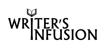
Then, another day, I typed "WRITER'S INFUSION" in Word and began running down the fonts. I had tried this before, but this time, I put the word "INFUSION" underneath "WRITER'S." I found a font I liked, and then copied and pasted the words into Windows Paint (that's about as good as it gets on my computer), and then I moved the word "INFUSION" closer to "WRITER'S," and aligned the "i's" underneath each other. I drew a crude picture of a book above the i in "writer's," and then sent the whole thing to Ray before rushing out of the house.
He sent it back, with one change. The i's were combined. I looked at it for a second, and thought, wow, teamwork is awesome. We spent another two days on iterations. The long "i" became a cursor. Then it became a fountain pen. But every other writing company on earth does the fountain pen thing, and besides, it looked like we were lighting the book on fire. On Dave's suggestion, we turned the book around, so that it faced us, the writers.
And then it was done. I just left a message with a local company about ordering a sweatshirt. We'll see how it turns out.